For Developers · Dashboard
Appearance
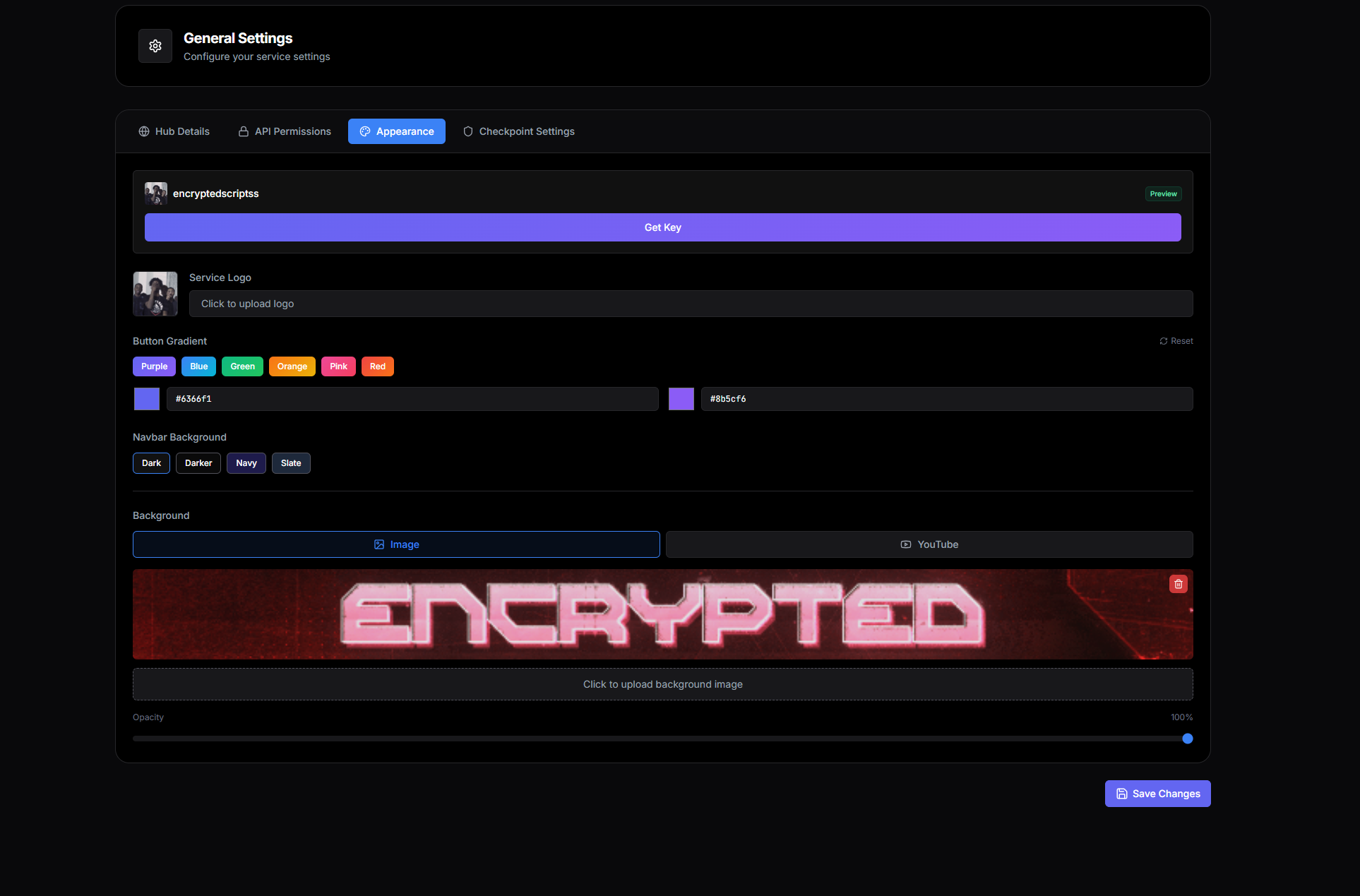
The Appearance tab lets you brand your get-key page with your own logo, colors, and background. Everything here is visual — none of it changes how the key flow works, only how it looks. A well-styled get-key page builds trust with new users and reinforces your brand for returning ones.
GetKey page theme
The first choice on the tab decides which design your get-key page uses. Every option runs the same key flow; only the look changes.
- Light: the Panda V2 design on a light palette. This is the default for every service.
- Dark: the same design, always dark.
- Custom: the same design with your own page, card, text, button, accent and side-panel colours, an optional background image, and switches for the wave pattern, bamboo and side panel. A live preview updates as you edit, and colour pairs that are hard to read are flagged.
- Legacy: the previous get-key page, still styled by the Button Gradient, Navbar Background and Background settings below.
On the Light, Dark and Custom themes your service name is printed large on the side panel, and your captcha (if you use one) appears in the Support Panda pop-up that opens when a visitor presses Continue, instead of on the card itself.
Saved changes go live quickly
Service Logo
The logo that appears in the top-left of your get-key page (and on the key-issued page, and in any branded webhook embeds). Upload a square PNG or JPG — anything roughly square works, but tall logos will be cropped to fit the slot.
Best practice
Button Gradient
Button Gradient, Navbar Background and Background style your Reset HWID and link-shortener pages, and your get-key page while the Legacy theme is selected.
Two color pickers define the gradient for your primary action buttons — the "Get Key" button on the landing screen and the checkpoint progression buttons throughout the flow. The first color is the gradient's start (top-left), the second is the end (bottom-right).
Below the pickers are five preset palettes: Purple, Blue, Green, Orange, Pink, Red. Click any preset to apply both colors at once — useful when you want a clean look without picking values yourself.
Navbar Background
The background color of the top navigation bar on your get-key page. Four built-in presets:
- Dark — neutral near-black, the default for most services.
- Darker — pure black, maximum contrast against light content.
- Navy — deep blue, pairs well with cool brand palettes.
- Slate — warm-gray, softer than pure black.
Pick whichever harmonizes with the rest of your appearance config.
Background
The full-page background behind the get-key card. Two modes:
Image
Upload a static image — a screenshot from your software, custom artwork, a Discord-style banner. Upload PNG or JPG. Large images are scaled to fill the viewport.
Opacity — a slider that controls how visible the background is behind the get-key card. 100% shows the image at full intensity; lower values fade it toward the navbar background color for better readability of the foreground.
YouTube Video
Paste a YouTube URL and the video plays on loop in the background, muted, no controls. Works great for animated banners, game footage, or atmospheric video that would feel awkward as a static screenshot.
The same Opacity slider applies — fading the video improves readability of the get-key card on top.
What the result looks like
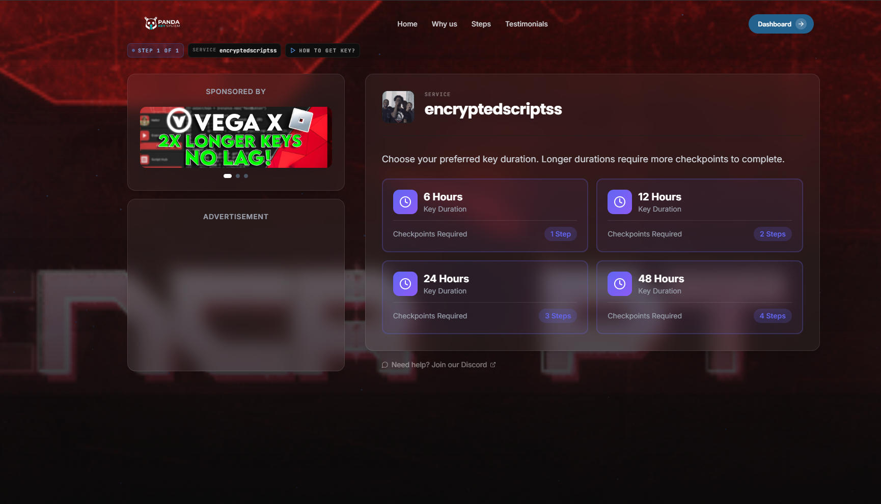
A configured Appearance setup produces a get-key page like this:
Test on mobile too